GG&Grace
Services: Strategy I Branding I Art direction I Layout Design
Client: GG&Grace Year: 2020
GG & GRACE is an award-winning design team specialising in high-end hospitality projects for the world’s most celebrated brands.
The interior design studio approached KUOZ to refresh GG & Grace’s brand identity and its brand strategy. The new look needed to match the company’s evolution and reflect a contemporary feel, without losing its established heritage.
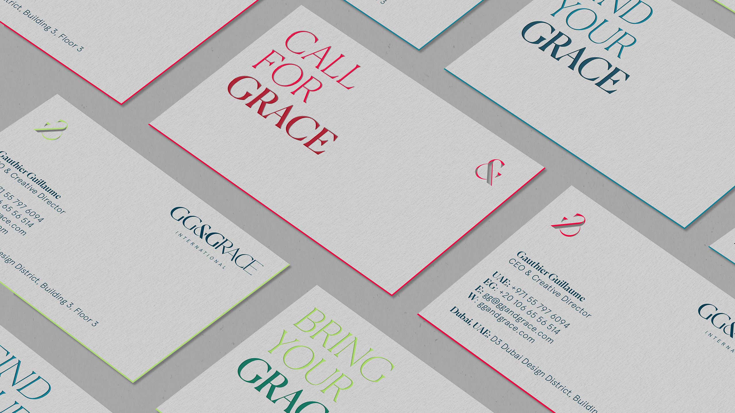
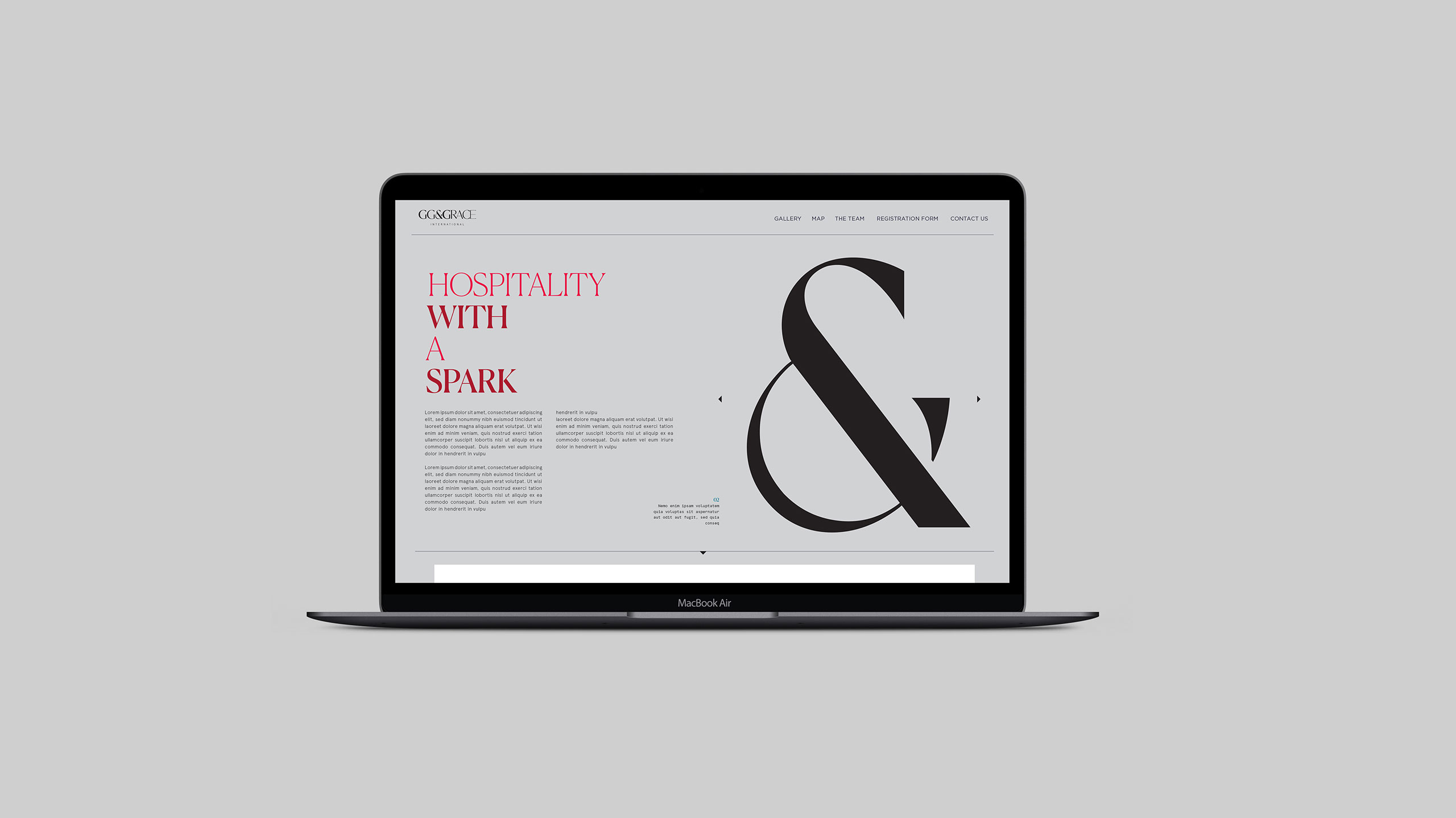
We designed a custom set of letters with the idea of emphasising the initials and applied a smooth gradient for the rest of the characters. The ampersand acts as the link between the two words and sets the grid for the logo’s whole aesthetic because of its distinctiveness.
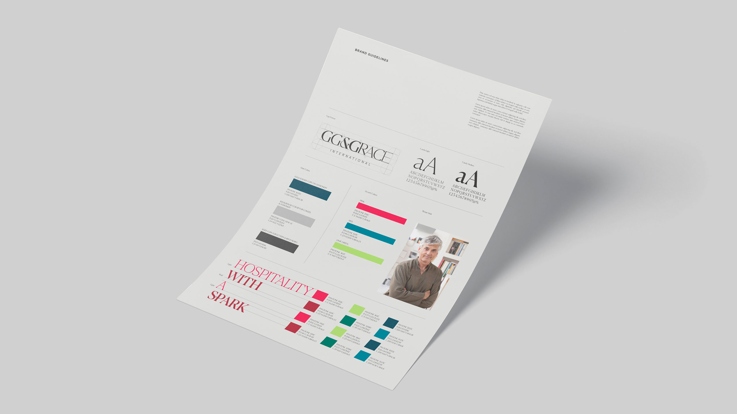
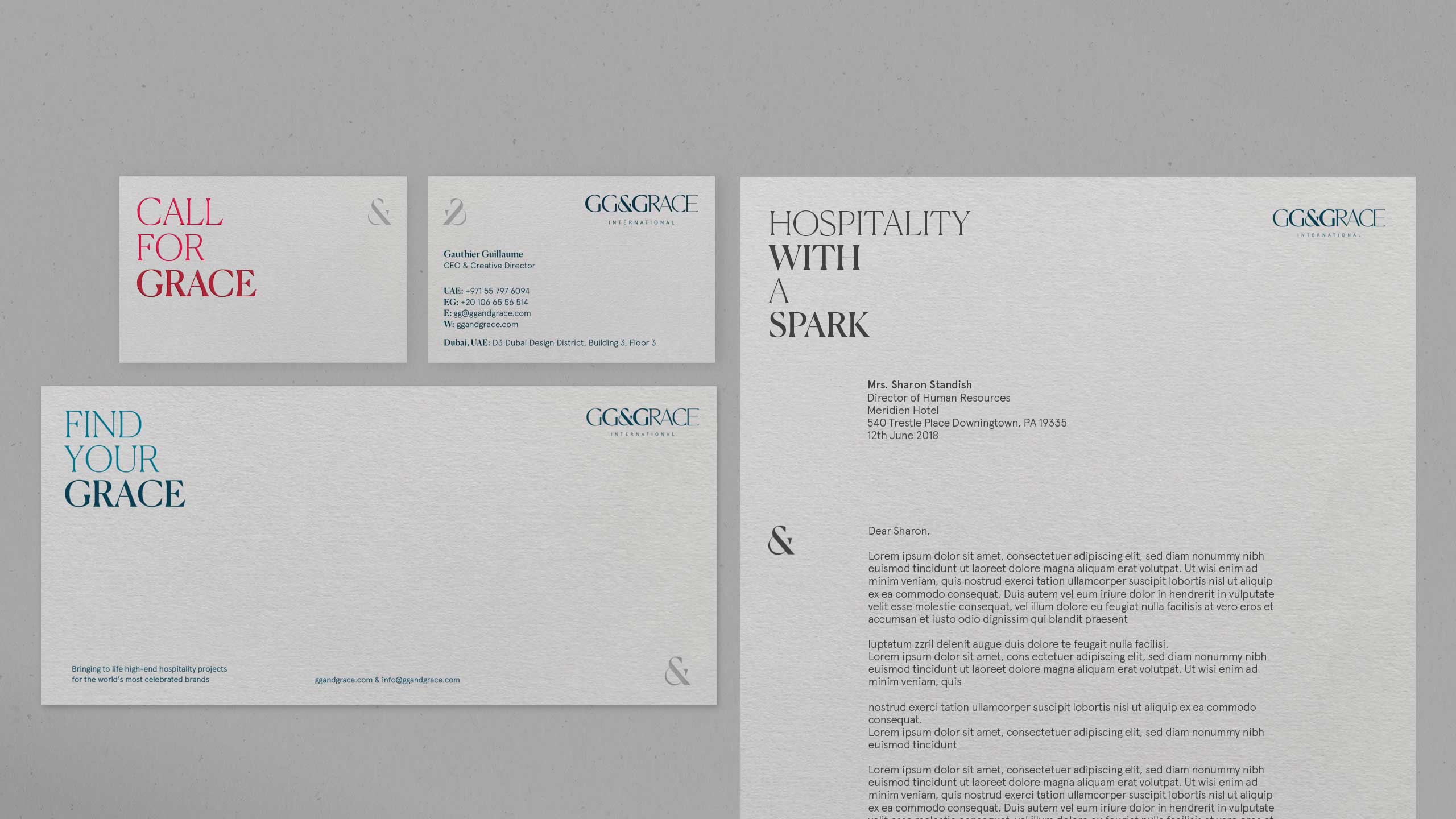
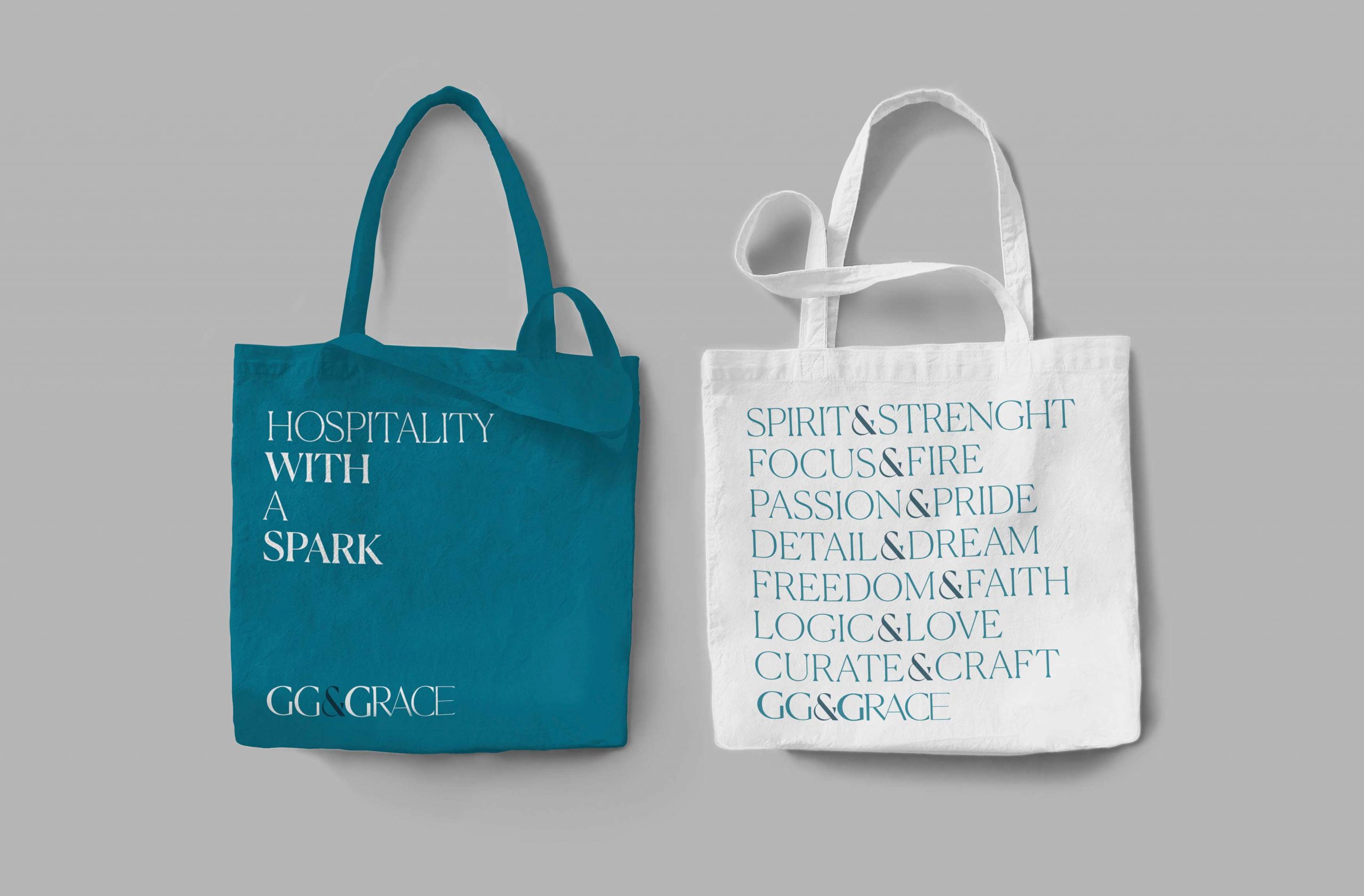
Once the logo was finalised, we proposed a wide range of typography and colour groups to establish a hierarchy from primary to secondary language. We used shades of soothing green for the main colour to maintain simplicity, and a vibrant secondary colour for key highlights to reflect the idea of growth and creativity.
‘Remarkable’, ‘Enterprising’ and ‘Far-Reaching’ are the key words that we determined underline the core brand values. We expressed their collective sentiment through the tagline’ Hospitality with a spark’. This tagline features as a supportive language tool throughout the brand’s identity and collateral.
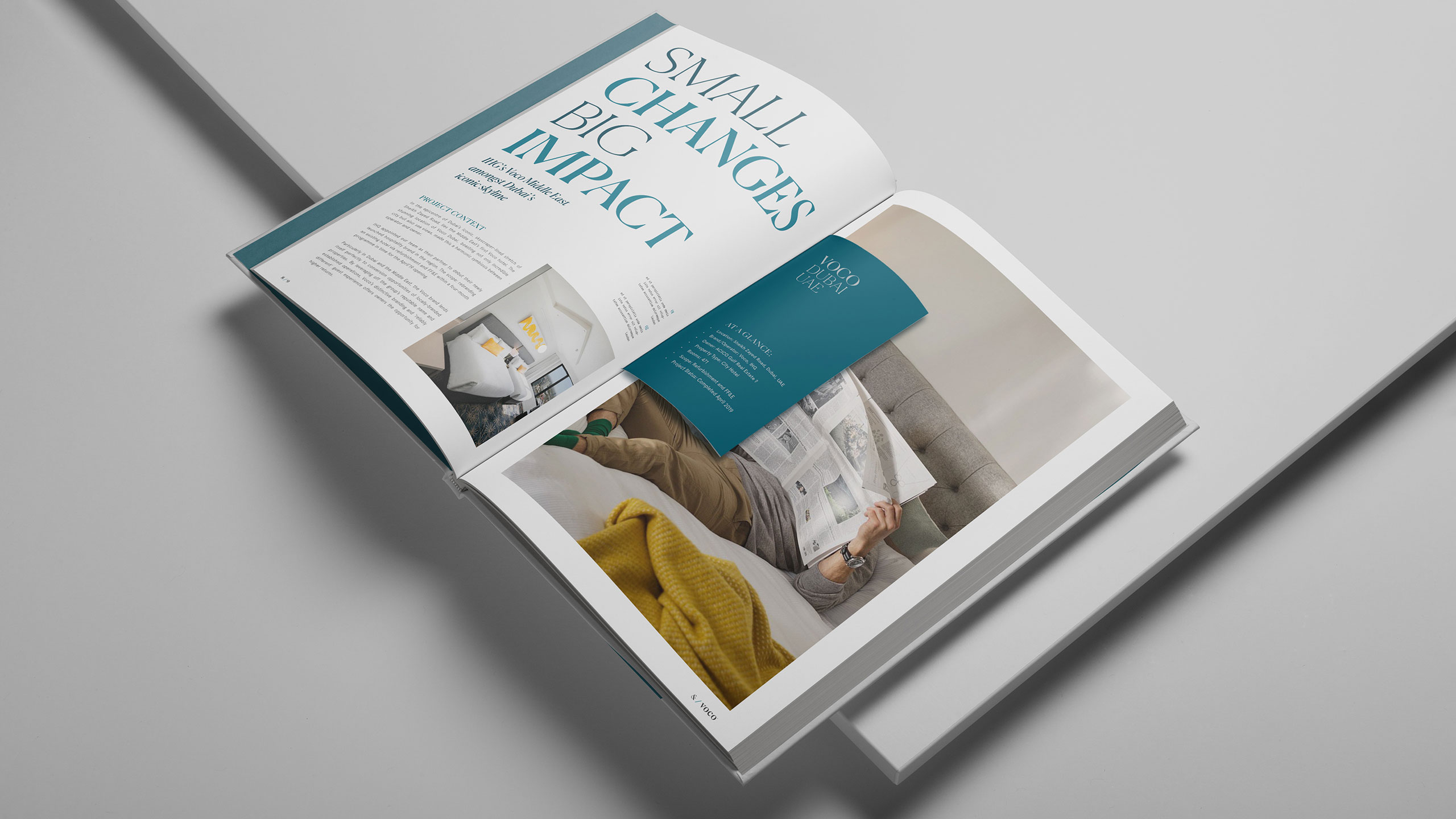
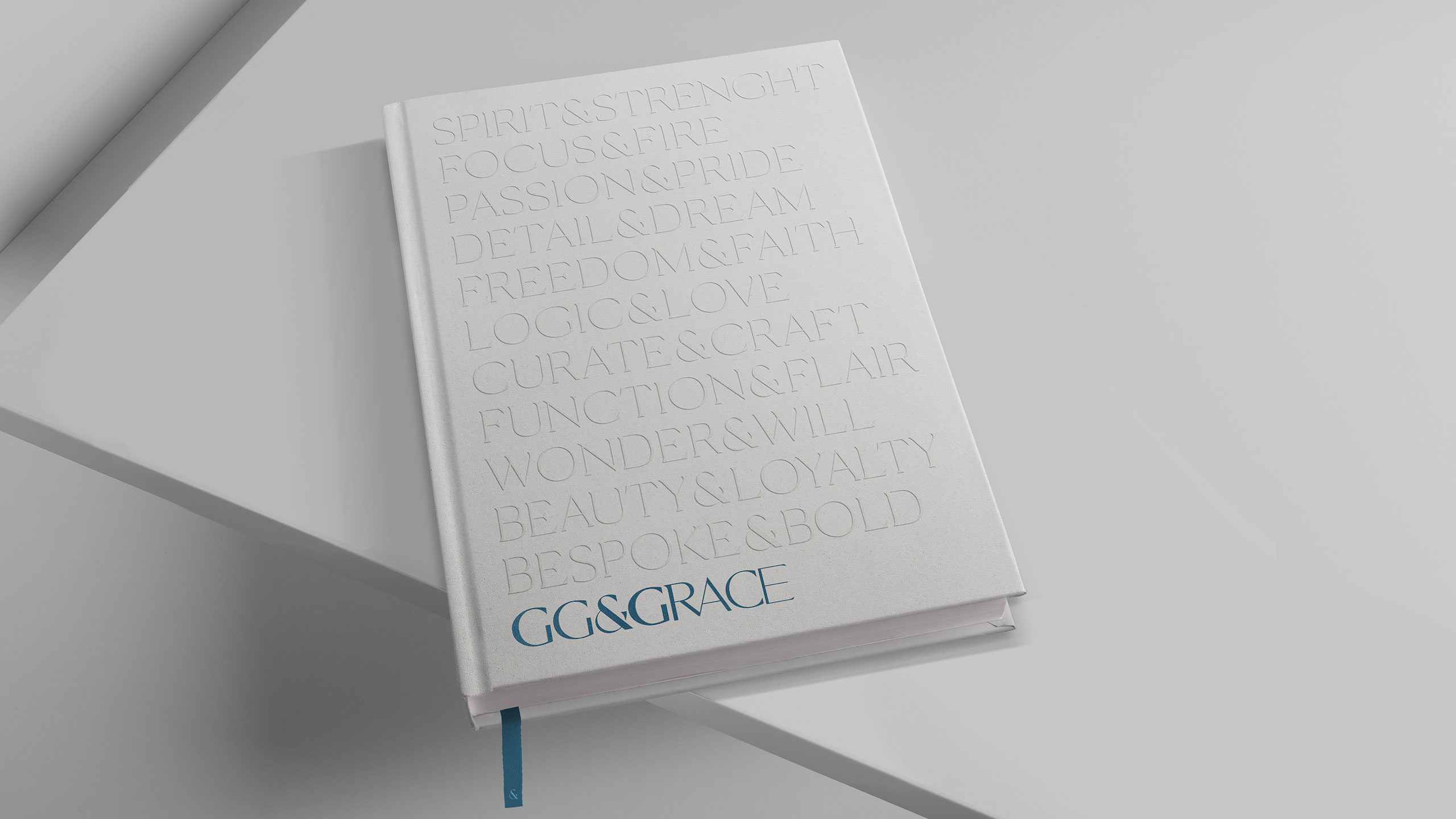
We also designed a company brochure wherein the typographic system is featured, and a set of templates for in-house designers to help them maintain brand consistency.