GG&Grace
Services : Strategie I logo & identité visuelle I Direction artistique I Layout Design
Client : GG&Grace Année : 2020
GG & GRACE est un studio de design d’intérieur plusieurs fois primée, spécialisée dans les projets haut de gamme pour les marques les plus prestigieuses au monde.
Le studio de design d’intérieur a fait appel à KUOZ pour moderniser l’identité visuelle et la stratégie de marque de GG & Grace. La nouvelle image devait refléter l’évolution du studio et une esthétique contemporaine, tout en préservant son histoire.
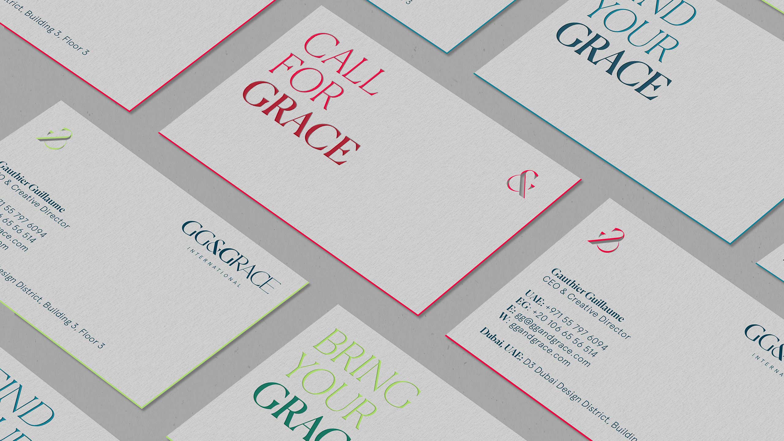
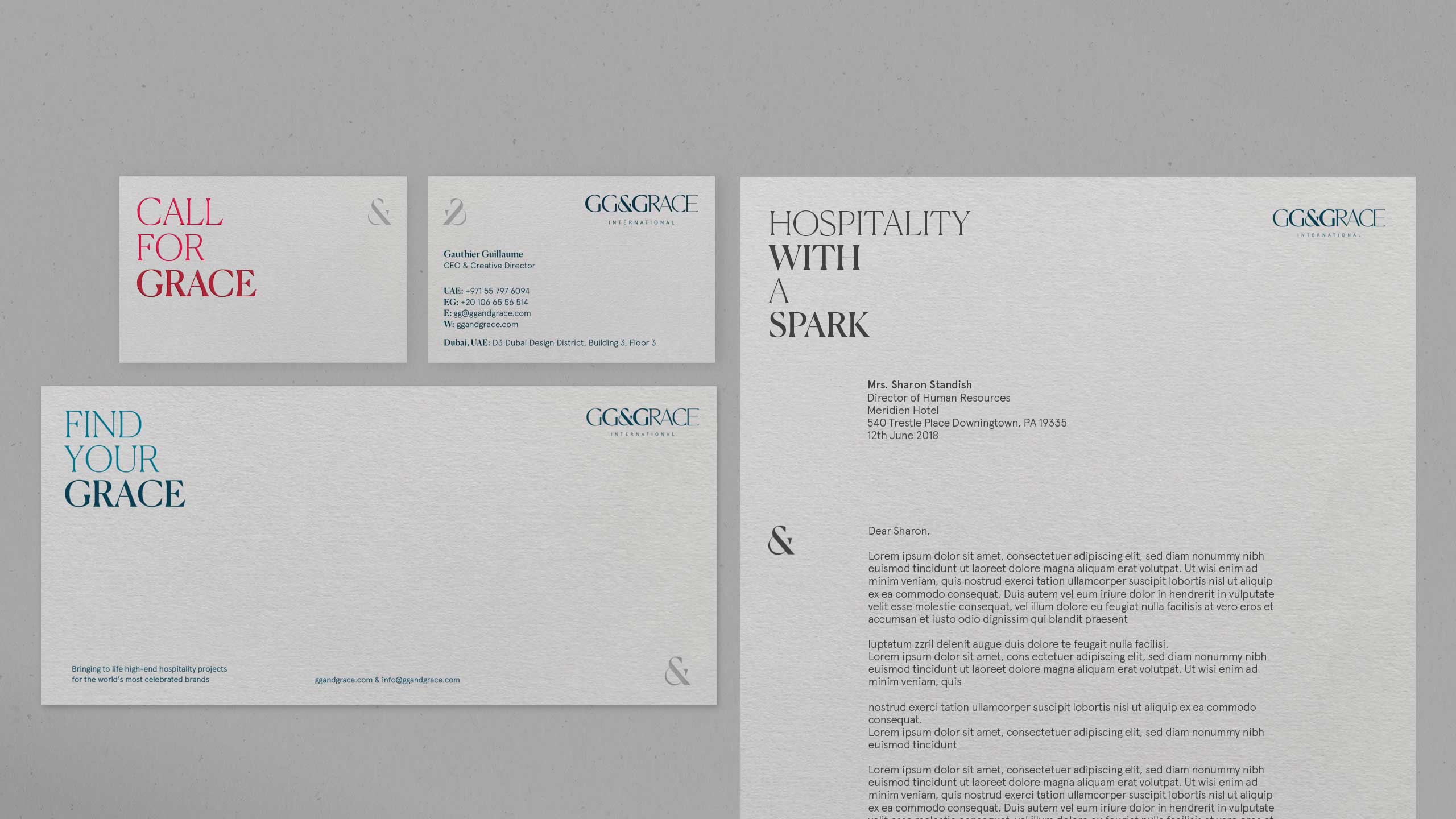
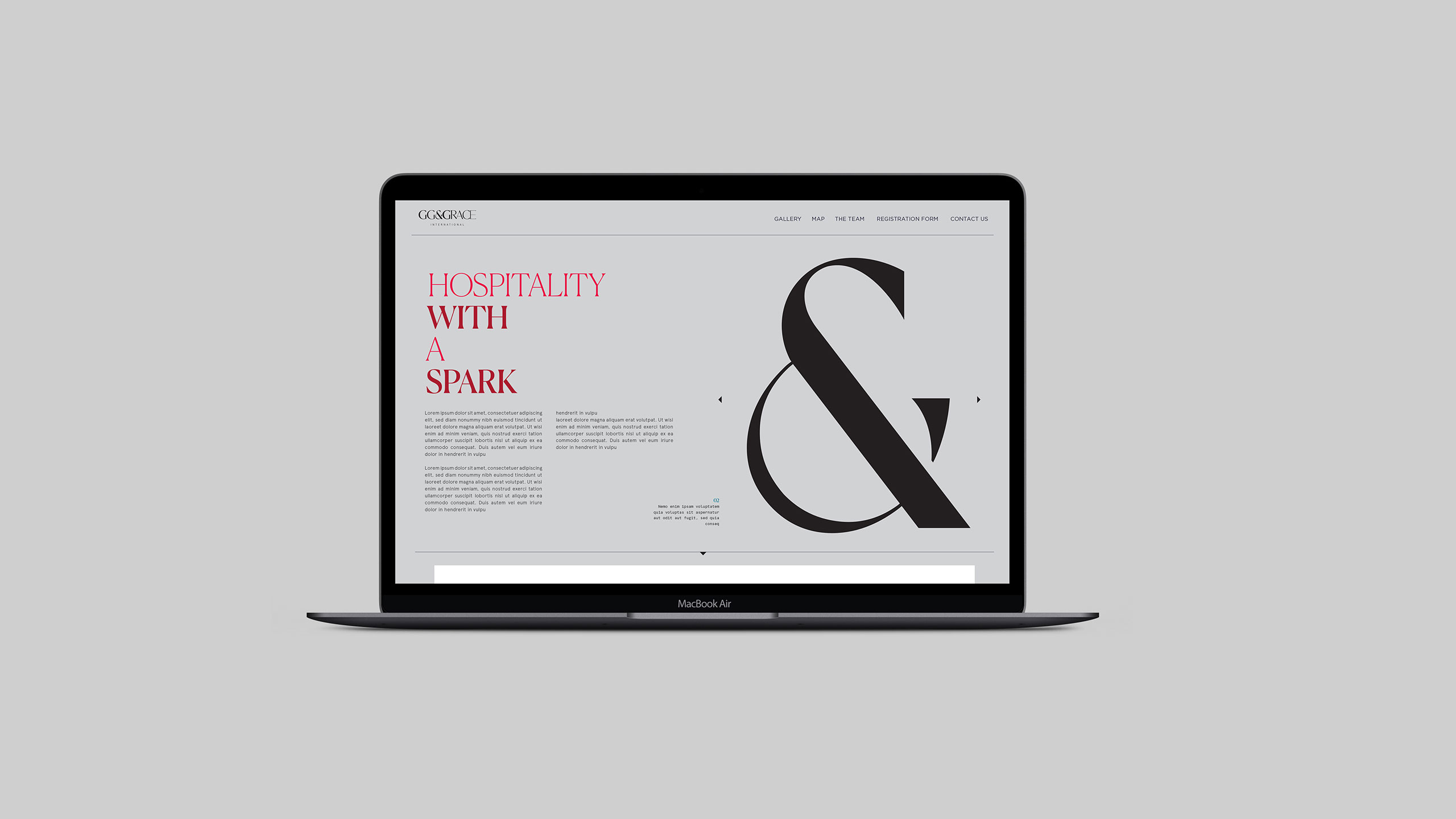
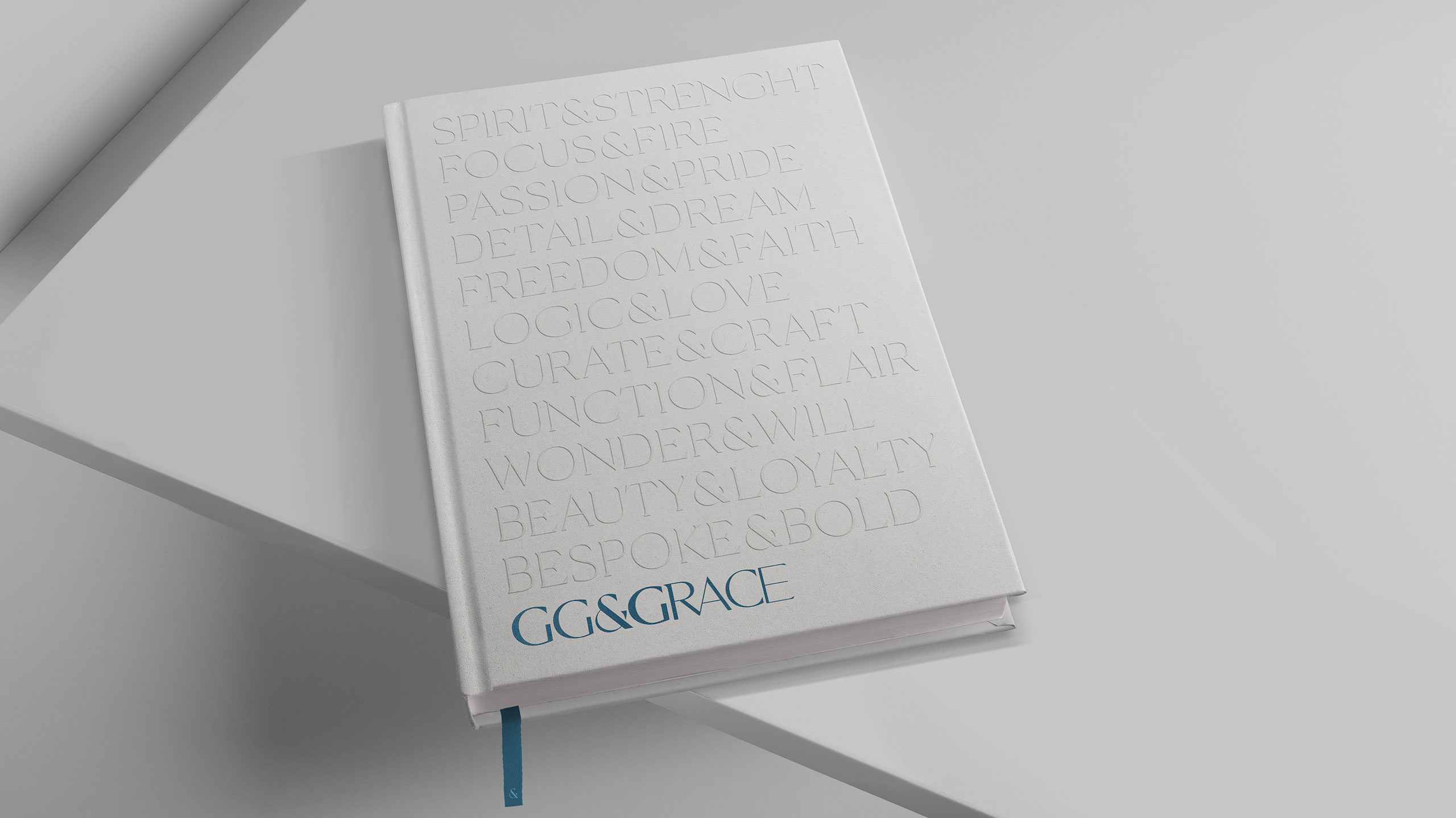
Nous avons conçu une typographie sur mesure mettant en valeur les initiales. L’esperluette joue un rôle clé en reliant les deux noms et en définissant la grille esthétique du logo grâce à sa singularité.
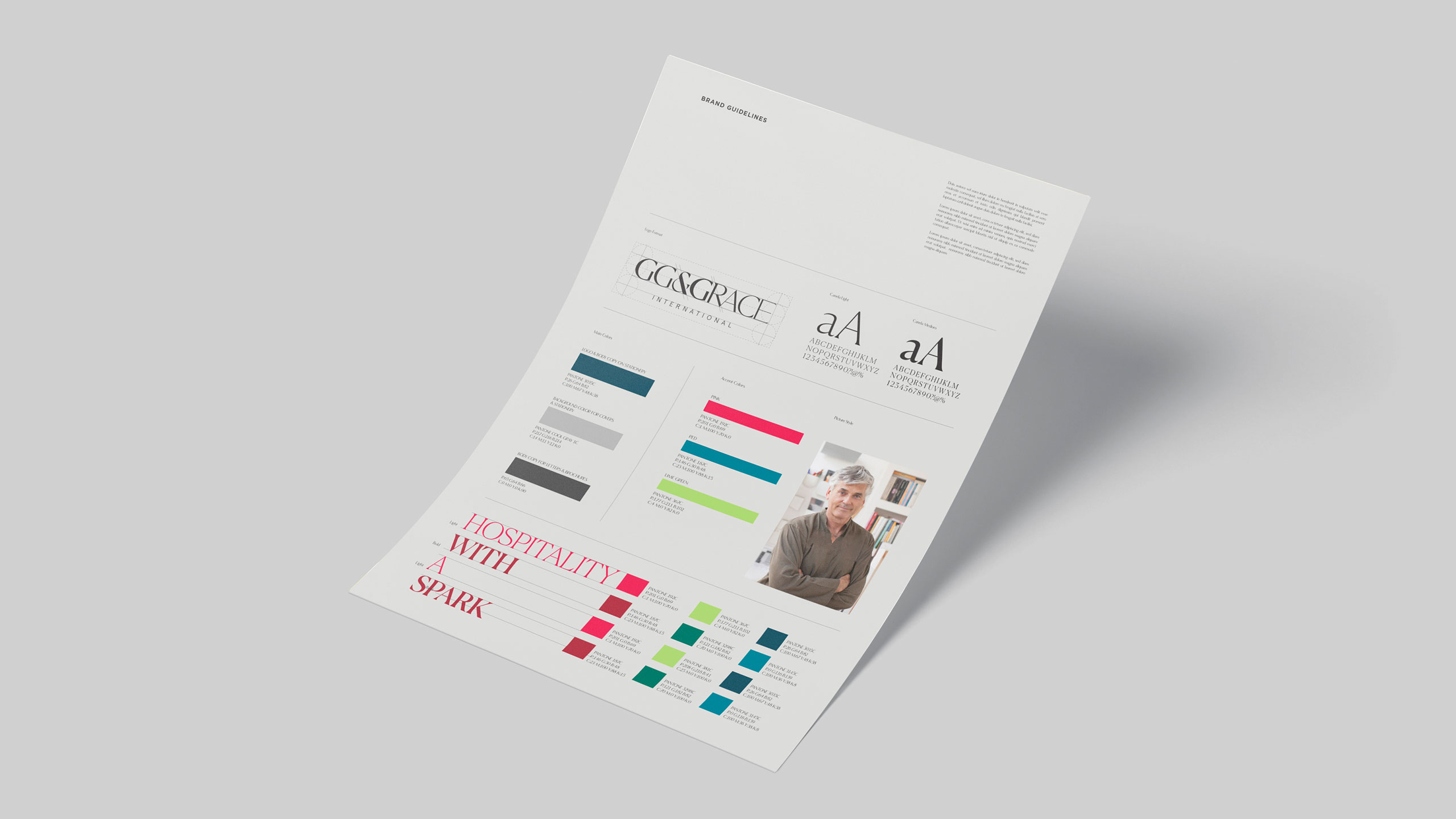
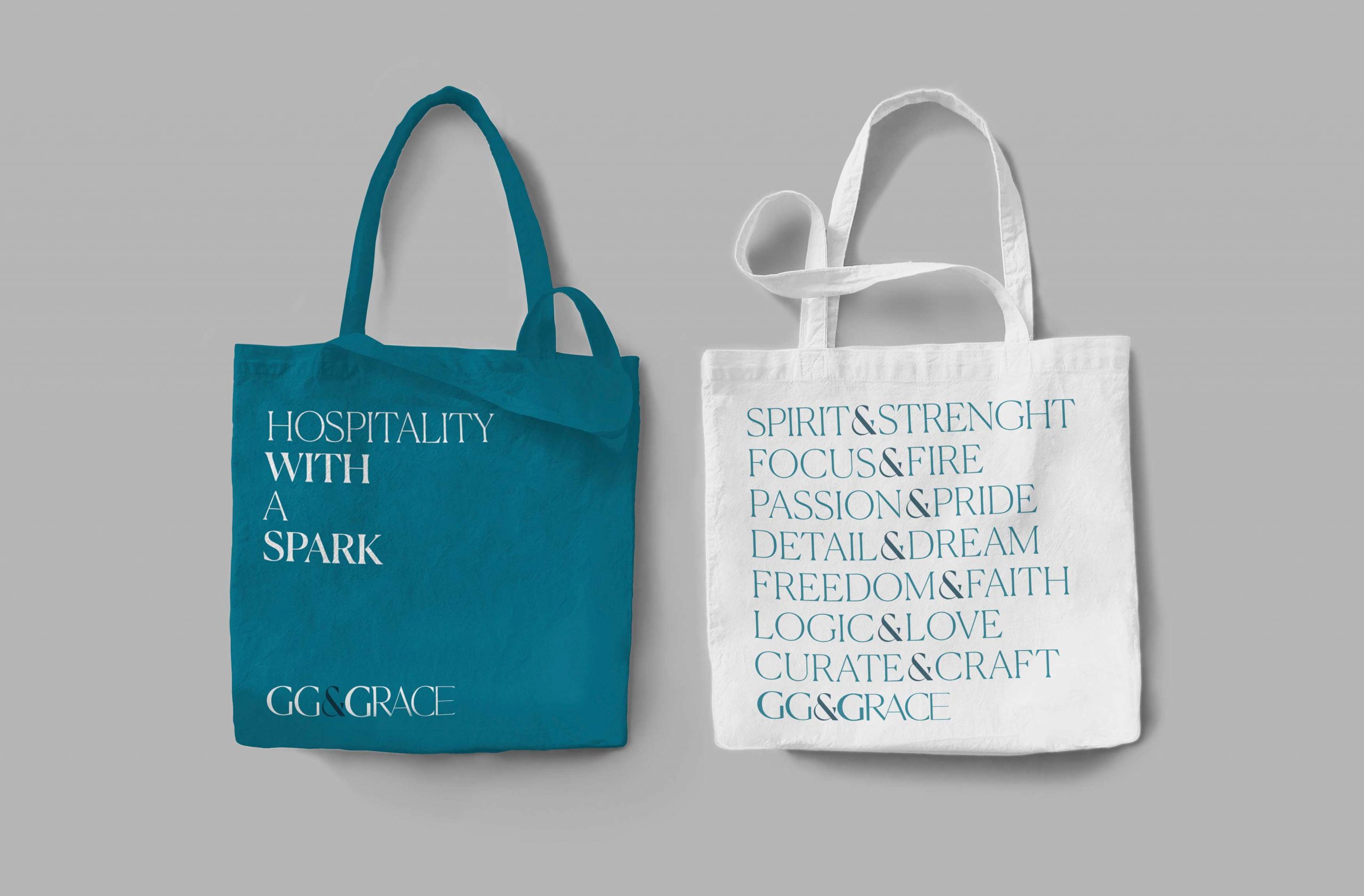
Once the logo was finalised, we proposed a wide range of typography and colour groups to establish a hierarchy from primary to secondary language. We used shades of soothing green for the main colour to maintain simplicity, and a vibrant secondary colour for key highlights to reflect the idea of growth and creativity.
‘Remarkable’, ‘Enterprising’ and ‘Far-Reaching’ are the key words that we determined underline the core brand values. We expressed their collective sentiment through the tagline’ Hospitality with a spark’. This tagline features as a supportive language tool throughout the brand’s identity and collateral.
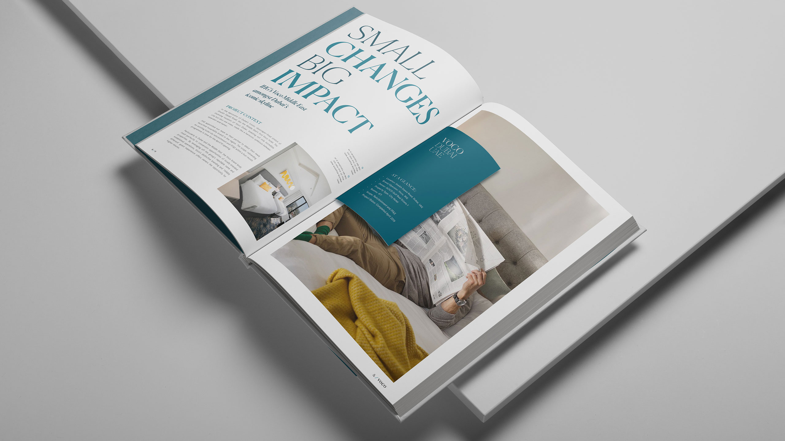
We also designed a company brochure wherein the typographic system is featured, and a set of templates for in-house designers to help them maintain brand consistency.